6.11.10

Extract Photograph with Wispy Hair for Accurate Background Replacement


original image: teal background conflicted with mauve background of business card template. Challenges: wispy hair, left-side shadow, earring glare)
First extraction with mauve background. Note, it has a slightly lighter halo around image. I also increased saturation to enrichen the brown complexion of the original.
Used techniques from second video tutorial to darken the halo around image so that darker background could be used.


The final image has transparent backgound. I thought it looked best on the template which had a slightly gradient background though it appeared solid.

3.11.10

Brainstorming ENP logo: Playing with Inkscape Tiled Clones


I was looking for a plain vector black arrow when I came across this arrow collage. Still inspired by the two main visual concepts of "people" and "arrow" to represent a slogan "Moving Forward and Up Together" as well as the stock photo below I thought of doing a collage of people in the shape of an arrow. Remembering an Inkscape tutorial, I used Tiled Clones and perspective to attempt the idea. The original tiling of people had to much uneven "negative" space which I couldn't figure out how to resolve with the Tiled Clone settings so I ended up having to hand tweek the placement of each clone.

Although I think my final graphic is a decent design, I don't think it functions well as a logo. Its too complex to translate to an avatar and may not show up well printed, etc. But at least I finally had a chance to test Inkscape cloning technique. My "people arrow" might be great graphic elsewhere.

Translating ENP logo sketches in Inkscape


Brainstorming for ENP logo and slogan

After discussing the success of my online community for lupus survivors during my vocational rehabilitaion classes, I was asked to create a social networking website for the Employment Networking Program (ENP). This group currently meets weekly to network with fellow members who have gone through the TN Vocational Rehabilitation process and are now ready to get a job. The group has a VR facilitator that provides helpful exercises and presentations for job readiness. The ENP group is a program and has no formal mission statement, slogan or logo, so in addition to developing the SN website, I am working on a logo and slogan to use when I customize the graphics on Socialgo.com the free social networking platform I have chosen for them.

I had an idea of representing the members not only networking with each other but being a support to each other move forward as they get past their disabilities which may have been holding them back. The ENP group is an eclectic group of people of different backgrounds, but as the facilitator constantly reminds them they have one thing in common, "You all want to work!" From this I came up with "Moving Forward and Up Together" as the beginnings of a slogan. I began doodling figures inspired by key words," group" "people" "networking" "forward" "up" and "together" in mind. My final concept is an abstract group of people with an arrow representing movement forward and up.

21.9.10

Natural Solutions: Designing And Generating Favicon

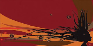
Created a 256 pixel square image for Natural Solutions for various iconic uses. The first purpose I had in mind was the website's favicon. The flowing hair does not show up against the background colors in the original icon when sized down to 16 pixels. So I created another favicon with a transparent background because the flowing hair is the more important visual to my client. AS I have already encountered, the flowing tresses just do not lend themselves to square layouts. Its chose to clip them rather than reduce the overall size to squeeze into a square. The original can be use as a social networking avatar.

NOTE: Favicon have to be 16 pixel square image in the .ico format. The original image may be created larger then scaled down by an online favicon generator; but original size must be a multiple of 16. I chose 256 as a manageable size to design in photoshop. Watch this TutVid for complete instruction on creation and code placement in web pages.

11.9.10

Error Fix | Adjust DIV dimensions for Padding

Can't figure out why dimensions aren't working out. Check your padding! adding padding adds to the overall dimensions of your DIV. For example you have set div width to 900 to match an image width of 900px, but the DIV comes out wider. It could because your set your padding: 30 (that 30 for all sides). This means that the left and right padding = 30 each. This adds 60px to the overall width of the DIV (360px).

Resolve by removing padding or add 60 px to the DIV width to adjust for the right and left padding.

Errot Fix | Zero Padding to Rid Unwanted Space

Working on subpages for the NS project, I decided to build my own html page with divs instead of a Photoshop generated table layout. But I couldn't get rid of this unwanted top space, even after setting the margins to zero. (didn't have this problem with table layout)
Padding the body at zero solved my problem. To be on safe side by default zero your margins & padding to avoid undesirable spaces that you didn't specify. The following code sets my layout to "zero" by getting rid of any unwanted spaces brought about by the browser. Note the auto margin in the outer div also centers the layout (see previous post). Need to start every new web page with this basic code to avoid headaches!
body {
padding: 0; 
margin: 0;
background-color: #D66D29;
}
#wrapper {
padding: 0;
margin: 0 auto;
width: 1200px;
}

10.9.10

Note To Self: Centering Web Page

  1. WARNING: If exporting web page from Photoshop don't forget to take into consideration which SETTINGS to choose greatly affects your centering options.
  2. The DEFAULT - TABLE based layout - allows you to easily center the web page in DW by right clicking in the white space, the choosing "center" in the drop down menu of the "Edit Tag - Table" dialog box. (You can also add the background color by editing the background of the table.)
  3. Choosing a CUSTOM - CSS based layout - will produced nicely named DIVs but the CSS will include ABSOLUTE Positions which can't easily be centered by normal CSS methods. You will have RE-LAYOUT the slices using new CSS. A real pain for any complex layout.
  4. Now to center webpage using CSS, you must use AUTO MARGINS for a DIV that wraps the entire layout which I usually enclose in MAIN or CONTENT DIV ( "text-align: center" is the fix needed for IE ) See this example used for my designables.net web site:
/** center web page in IE6 add text_align:center;
re-align left in wrapper **/
body {
color: #CCC;
padding: 0;
text-align: center;font-family: Arial, Helvetica, sans-serif;
font-size: 14px;
background-color: #000;
background-image: url(images/bg.gif);
background-repeat: repeat-x;
}

/*** center web page: add auto margins outermost div; 
but re-align text center to make up for IE fix  ***/
#wrapper {
width: 670px; 
text-align: left;
border: 0px; 
padding: 0;  
margin: 0 auto; 
}

1.9.10

Reduce Page Weight and Improve Web Site Performance

According to a August 2007 survey performed by Nielsen//NetRatings, 83% of home users in the USA are now using high-speed broadband Internet connections. While that number is growing and the news is good, it still leaves 17% of home Internet users in the USA on 56k or slower dial-up connections. If you have a business that caters to the rural community in the USA, you may want to take notice of the fact that many homes in rural areas still do not have access to high speed Internet connections.

Numerous surveys have indicated that the average threshold or patience level with Internet users is about ten seconds. For every five-second increment over that, larger and larger percentages of users begin to abandon a Web site.

The practical limit if you want a Web page to download and render in a user’s browser in ten seconds or less is 60,000 (60k) bytes. Meeting the ten second mark for a dial-up connection also requires that a user have a good 56k connection, which most users do not have. I have personally seen PCs in farming and rural areas where the conection speed does not exceed 14.4k.

Most e-commerce sites will have a very difficult time keeping page weight below 60k. If you display a lot of product images on your Web pages, consider using thumbnails and make sure that each is properly optimized using a good image editing tool. I find that you can stretch the page weight limit for e-commerce sites to about 100k (100,000 bytes), but you will experience significant user abandonment when you venture past this point.

http://www.tech-evangelist.com/2007/09/02/page-weight/

15.8.10

Natural Solutions: Detailing the Welcome Page

Although the client was satisfied with the previous design solution, I was not. I moved the owners quote from the header to the body where its more readible. I added some rounded corners to feature text and images on the welcome page. In addition, I added some standard buttons to link to sub pages. A "continue" button will link welcome text to the About Us page. Each featured product has a "details" button to link to its section on the Products page. I colorized some gray-scale social networking icons to match. I hope I won't regret when I begin to slice & code this. live website

1.8.10

Natural Solutions: Final Design Solution

After feeling a bit more confident with the pen tool I added some waves to the header background, reminiscent of the original artwork. Some subtle drop shading completes the artsy textured look and feel I was after.

21.7.10

Natural Solutions: Design Solution with product spotlight

Working on body now that header is about complete. After reviewing the clients product inventory list, I decided to feature each of the vendors top sellers on the home page. I offered to provide copy for the client who has been to busy to contribute much. I chose a quote by the owner from a local newspaper article to use for the slogan text. She was very pleased. I'll use the article and brochure text I was given for the Welcome / About Us pages. Still waiting on content for services and FAQs.

4.7.10

CBC Project: Repair curb & brick in church photo

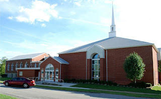
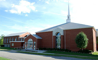
This was the results of my revisions to the church photo so far. (taking out phone line & parked car in previous posts)

I decided to continue inmprovements by fixing the crumbling curb, extending the newer lighter concrete sidewalk and lawn using Vanishing point techniques. In another layer I use VP to select and paste a better version of the brick I previously stamped in place of the removed car. I used the burn tool to age it a bit, then added a little more to the shrubs.

3.7.10

CBC Project: Removing and moving objects in photo

The original photo of the church has a lot of clutter that needs to be removed: telephone lines criss-crossing the beautiful clouds and blue sky and a car parked in front.
 
My first challenge was to remove the telephone lines. ( Methods explained in previous post.)


As my son would say, "Just for the LOLZ" I moved the car down the street. Basic steps: duplicate original layer, use move tool to place it down the street, trnasform tool to resize and distort to look natural in the perspective, duplicate the resized car, select the layer for the resized car go to EDIT>FILL... select 50% gray, rename layer shadow, use transform options to orient the shadow. I also used FILTER> Motion Blur to smooth out jagged edges of shadow shape. Last I created an elipse, filled with black #000000 for the darker shading under the car. (I used the original car as model) Last of all, I selected the moved car and desaturated to give it the effect of distance.

Here's the last revision removing the car completely! I used a combination of techniques to get rid of the car and create a landscape in its place. This was extremely complicated, because of so many elements with different textures colors  and shapes. I duplicated the car so the original wouldn't be destroyed in the process. I selected the car with the Magnetic lasso, then began the painstaking long tedious all night task of using the Clone Tool (Stamp Tool PS-CS4) to select, copy and stamp a thousand sections into the area of the selected car. After deselecting the car there were still areas outside of the selection that need to be edited. I used the Vanishing point techniques to create several panes for the finishing the details of the landscaping. I used one pane for the road to extend the shadow left behind. I used panes for the different shades of grass and extended the dark shaded grass to the end of the photo over the sunlit grass so the foreground would be the same. I got very detailed by using separate panes to build up the flower bed and extend corners of the landscaping logs on the corner of the building. Obvious the shadowing is not accurate to the laws of light & perspective, but it looks natural enough.

No pixels are selected?

Why, when trying to make a selection within a layer with my lasso tool, do I always get a pop up that says"No pixels are selected" ?  One reason for getting this message is failing have the layer active which has the object you are trying to select. But I am sure that I am in the correct layer which is not an adjustment layer. The marquee tool works but its not a useful option for the "car" I am trying to select within this photo. For now I am switching to the polygonal selection tool.

Hmm, I see this is also weird. There's a long delay from one point to the next. Perhaps it the problem is the file size of the photo causing everything to move so slow, that the dragging of the lasso won't compute at the speed of my hand....

File size under 200kb.

UPDATE: After restarting PC. Alls well. Lassoing just fine. Boy did we waste alot of time. When in doubt ALWAYS RESTART PC.

How can I get rid of the Hand in Photoshop!

In the middle of a project one day, I try to switch to a tool but instead of the apprropriate tool I get the "hand" instead! I kept switching to different tools. No luck! Finally I Google "How can I get rid of the Hand" and got various answers. Most worthless. But someone, said "hit the space bar." It works. This has happened repeatedly since the first time and I always waste time before remembering the remedy. So I decided to document the answer in my own blog.

CBC Project: Removing objects from photo with Photo shop stamp tool and vanishing point.

Finally found this photo for Central Baptist Church web site. Its a full view of the from. No weird artifacts, but I'd like to get rid of thee telephone lines and the car. Using the Photo shop stamp tool and vanishing point...
  1. I duplicated the original layer(above background)
  2. Created new layer above "background copy" Named it "remove telephone lines"
  3. Using stamp tool to remove telephone lines from clouds and sky ONLY.
  4. Go to Filter > Vanishing point. Create grids for each plane on church roof, window, brick sides, etc that telephone line intersects
  5. Use selection tool to select matching sections; ALT CLICK selection and move and paste over the telephone lines.
  6. Helps to keep toggling the zoom back and forth so you can see pixels for editing and out to see how it looks at 100%
  7. click OK when satisfied. Hope I didn't forget any steps.
Well, I think I removed the telephone lines with out disrupting the natural characteristics of the clouds and sky really well

1.7.10

Natural Solutions: Second Design Solution with new graphics for artwork

As I explained in previous post, I have render a layered vector image almost exactly the same as the original artwork from which I could select and re-size any element of the drawing. I decided to select just the "flowing hair lady silhouette" and re-size it...


I also created a new version of the florets which has more detail and dimension than the original...


I put various sizes of the florets with the resized lady to recreate the artwork for the web page. I also intend to use the florets as a continuing motif in the design: as part decoration, navigaton & rollovers;


This is still a preliminary rendering of the second design solution. Once more of the content has been established, I will determine the layout and arrangement of flourishes. I may also add the background orange "waves" like the original once the other elements have been established. Must choose font and style the text for site name, etc. Plan to adjust the dimensions and fix the browser display dimensions to display the artwork-header to fit the entire browser window.

26.6.10

Natural Solutions improved artwork helps web design, but rectangular shape still has constraints.

My first design solution was limited by inability to resize the original 437 pixels with even more destruction of the image. In this mockup the image was transformed to 600 pixels wide.
The new clean image provides a decent quality for a design solution; how ever there are some constraints to the possible compositions due to its rectangular shape. If I break up the primary elements of the artwork, the lady from the stripes I will have more possibilities for design solutions.

Natural Solution's poor quality jpeg artwork to a clean vector image

Original image submitted by client has jpeg artifacts.


My first attempt at improvement was to smooth out the artifacts with photoshop brush.


I finally, decided to import the image into Inkscape and trace it creating a clean new layered SVG file that I can resize...


...as well as select the specific elements from its layers.

12.6.10

Designables Web Site Uploaded

FINALLY! This week was spent finalizing a design I could live with. The site was designed & spliced in Photoshop, coded in Dreamweaver. Uploaded to directly to GoDaddy from Dreamweaver. It was my first time publishing from Dreamweaver. What a breeze! I want to give credit to the six revisions tutorial that inspired me.

4.6.10

Natural Solutions initial layouts centered on artwork.

Two examples of comparable natural hair salon websites used for initial consultation with Natural Solutions owner lead to first mock ups to illustrate possible layouts incorporating clients artwork & color scheme. She was very pleased with my proposal and accepted my terms. I am drawing up the contract. I like using Inkscape in its simplicity to brainsorm preliminary layouts and design ideas. The vector tools are easy to manipulate and move around element than photoshop.


Removing artifacts from Client's compressed jpeg copy of vector art unsuccesful

New client's only graphic asset, currently being used for signage, business cards and flyers. Unfortunately, they don't have the vector original. So I am working around this compressed jpeg which they cut out some of the silhouette along with the text. I tried using Photoshop (filter>noise) to remove artifacts but it just doesn't help sharpen a jpeg copy of vector art.

Learn Photoshop - How to Remove JPEG Artifacts

24.5.10

Vector freebie inspire quick header to customize social network template

Free vector art of butterfly makes good avatar and used for a custom header for Lupus Support Network on Socialgo.com free template. http://lupussurvivors.socialgo.com/

16.5.10

designables rectangular logo is poor avatar

As you can see the logo for designables does not make a good avatar. If your logo is a shape that fits nicely into a square it may make a good avatar.  longitudinal images do not. If I had used my original choices pinkturtle or 153fish, I would have created mascots like the @twitter birdie to be my avatar. No worry, as I was designing the logo I was already considering the avatar. The first initials of text logos are often used for abbreviated versions of the logo that can also serve as avatars. See @google, @wired. That's my plan too.  I made a perfectly square avatar. 48x48 pixels is the optimum size for twitter.

15.5.10

Custom Twitter Background for designables

I resized my logo and created this twitter background in photoshop. Now I am starting to see that this complexity of gradient makes this logo ineffecient for manipulating for different uses. I manage to size down w/o losing much quality of gradient but the text doesn't show.  I tried down sizing the "design" part and add "ables" text in the right proportions. But no more. I am still waiting for inspiration for the right visual concept for designables....meh. anyways, I do like the slight black gradient. check out my twitter @designables

Creating "designables" to customize web template


In continuity with the new banner, I provided other "designables" such as this page heading to customize site template. And some graphic containers to highlight specific content.

Designables is my terminology for the graphic elements that can be used to economically customize a basic web template. I inserted the graphic containers as background images in place of just using a teal background color.
Related Posts with Thumbnails