Showing posts with label Nuli Nuli. Show all posts

20.2.11

Adding background images to form elements destroyed the alignment. Adjustment to padding and margins helped realign elements but the cross browser differences were drastic. esp in IE. see Global White Space Reset.

18.2.11

Nuli! Nuli! Project: Final mockup

Final mockup approved by client. Improved design solution for buttons.

16.2.11

Nuli! Nuli! Project: Sunburst Background

For the background I decided to use the sunburst image like in popular comic books to fit well with the wushu action figure. It was created using advanced photoshop filter tricks instead of drawing. Start with 2 color gradient. Then distort using wave and polar filters. See this great tutorial:
http://www.recipester.org/Recipe:Create_sunburst_effect_in_Photoshop_32566105n

15.2.11

Nuli! Nuli! Project: Wushu Logo Design Finalized

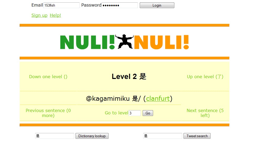
I have completed a logo design and web page graphics for the Wushu concept using photoshop. I simplified the sillohette and added some angularity before incorporating with text. I made the text slightly 3 dimensional with a smooth gradient effect (avoiding typical glossy style as you requested). To characterize the wushu action and emphasize the "work hard" charge, I gave the text a slight deformation.


The finished logo (and arrows) has a flexible transparent background. As requested I did not replace the links with buttons; instead I also produced color coded arrows to make its interactive interface more obvious and give clarity to the web sites functionality. They can easily be removed from the table cells. Client was very happy with the design so far. Neither of us were happy with the button style yet.

12.2.11

Nuli! Nuli! Project: Wushu Logo Design Evolution

Developing the logo in Inkscape, using san serif fonts according to client preferences. (Futura Myriad or Blackout)
Turns out all caps Blackout provides the best symmetry.
Decided green & orange color combination provides the contrast and fits the WUSHU - Work Hard charge...as opposed to pink/green for instance.
Added slight gradient to text.

10.2.11

Nuli! Nuli! Project: General Layout and Styling

Nuli! Nuli! Project: Logo Design Sketches

Using Asian cultural objects as the concept, these very basic vector sketches are the first step
in the evolution of icons for your logo. Clients preferences run parallel to my own opinion. I thought
the Washu figure invoked “Nuli! Nuli!” (Work Hard!) as well. The next
step in the logo design process will be “photoshopping” one of these basic shapes and experimenting
with typography choices.

Lotus
The Lotus was not one of clients choices, but I had already started my idea as vector. It’s
simple symmetry and scalability makes it a suitable logo, icon or avatar image. Also
readable in black and white.


Chinese lantern
Another simple symmetrical shape that works for a logo, icon or an avatar. This simple
vector image could be used with some simple styling. My only concern was that it may
be mistaken for a Christmas ornament without detail. I have already begun a detailed
colored rendering for the lantern. I need to brainstorm about exactly how to incorporate
it on the page. I would need to work that out as I am determining the page design.

Yin Yang
This image has strong appeal from a design stand point. It can stand alone as a logo,
icon or avatar without text yet easy to incorporate with text. As a geometric shape, its
easily scaled up and down for other purposes. If necessary for black and white print, it
would read well in this pure form. The round shape is fits popular Web 2.0 styling for
icons.

Wushu
This is a rough photo shopped extraction. Although a simple silhouette is my intention
for the logo, I would need to clean up the edges and recreate as a scalable vector
image. (Current format pixilated)


Any of these concepts can provide a strong visual impact that conveys an instant
message about what your website is about while maintaining simplicity in the overall
web page layout. Let me know what you think of these preliminary shapes and
which ones you would like me to continue to develop.

I will soon begin the general CSS styling on the pages, reviewing the mobile device
constraints in order to plan how to incorporate logo and some minimal graphics for web
page design.

8.2.11

Nuli! Nuli! Project: Logo Conception - Asian Icons

The premise of our design solution is to incorporate a popular Chinese cultural icon with the Nuli! Nuli! text. I feel the symmetry of the repetition in the site name points to a symmetrical configuration of  the logo/text with the icon in the center.

Nuli! (icon) Nuli!

Since first considering this project I have spent a lot of time researching Chinese culture and doing rough sketches on paper. Out of the many iconic objects I discovered, I felt the objects listed below might have potential to be abstracted into silhouettes for a suitable vector image for our symmetrical logo:
Pagoda, gong, Great wall, ying –yang, Buddha, lotus, lantern, Chinese coin, fan
A silhouette of the pagoda immediately conveys CHINESE.  It’s symmetrical.  I can imagine several ways to render; a simple outline; a solid silhouette of 1 color, 2-3 colors used for each roof layer (your bright color scheme.

The lotus and lantern are also very suitable symmetrical icons, with opportunities for many graphic design techniques using your bright palette of colors.

I imagined incorporating your alternate title, N!N!  in a circular icon inspired by this Chinese coin. The duality of the N!N! could be expressed in the two halves of the ying-yang shape. N! in each half.


The wushu martial artist came up as a potential icon; It says “work hard.” I saw this photo (below) and imagined a vector of an abstract silhouette with arms stretch out to juxtapose the 2 Nuli!'s A suitable image of this complexity would be more challenging to render and take more time.

As I said the red paper cut outs really intrigued me. I have a techniques for rendering a vector image that’s a floral conglomerate similar to the nciku example (below), but it might prove quite time consuming to come up with visually satisfying arrangement and replicate a style that signifies the Chinese technique. I also imagined using a cutout (stencil) text effect --  nuli!  text cut out of red a background -- suggesting Chinese red paper cutouts
The possibilities for creating a logo are always infinite. It’s important to get the client to think about their target audience and the perceptions they wish to convey. And more importantly it’s important for the designer to facilitate communication to arrive at the most appropriate design solution. Although I may favor certain choices due to my ideas for toward rendering them it’s most important that the image fulfills clients expectation of the visual identity for the web site.

7.2.11

Nuli! Nuli! Project: Color Palette - Mobile Design Consideration


 One of the first steps for design conception was getting color preferences from the client.

Legend for color palette
flickr pink       smashing mag orange        nciku green   yahoo purple
flickr blue       twitter blue                 nckiku red paper cut            black
gradient color - minimalist background shading
 
More than likely the final design would use no more than 1- 3 colors. I will be picking from this palette for sketching ideas for graphics and text.
 
Moblie Device Considerations
The W3 Mobile Best Practices USE_OF_COLOR - states that you should make sure that information conveyed with color is also available without color.

Should use contrasting foreground and background colors means for a readable page that does not use colors for the background color and the text color that are too similar.


Related Posts with Thumbnails