 Image via CrunchBase
The Nuli Nuli website needed to display as a "full" website on monitors as well as comfortably in mobile devices, I had to research
mobile device usability.
3 categories mobile devices
1. Devices with screens that have widths between 320 and 480 pixels, that support CSS, and that support screen media types and media queries. This includes the iPhone, the G1 and many Android devices.These devices will be able to support all of the optimizations we put in place.
2. Devices that support CSS and that either support the handheld media type or support the screen media type and media queries and have screens smaller than 320px wide. We'll create separate, simplified CSS rules for these devices since their screen size will limit what they are able to display.
3. Devices that don't support CSS.
240 x 320 (a.k.a. QVGA) should be the standard for mobile development. Use 320 pixels wide mock-up.
Lucky for me the client was only targeting the newer mobile screens, Android and iPhone, so I didn't have to contrain my design for small screen devices.
My primary referance was the
W3 Mobile Best Practices. I made notes of the items to consider for visual design such as images and stylesheets. Here are some mobile device usability considerations from various sources.
* The site logo should be replaced (or adapted) for each device grouping to ensure image clarity.
* Headers should stretch to 100% of the screen width using the supplied background image where possible.
* Content images should be no larger than 200px wide for the 'default grouping' (or 80% of the device's screen width).
* Content images should be automatically scaled and optimized to screen width if an alternate does not exit.
* List icons are not to be used on displays smaller than the 'default grouping' in order to make as much space available for the actual content.
* A dynamic style sheet is to be used in order to set many values on-the-fly for each device, and cached appropriately.
most sites designed for mobile website are aligned to the left with content in vertical stacked fluid containers (no floats). Good examples of mobile websites:
http://mobile.fandango.com/ good example for CSS styling w/ client colors orange and green -- also like the black outline on red-orage logo
http://mobile.theonion.com/
http://home.mobile.msn.com/en-us/default.aspx
https://ssl.m.bestbuy.com/m/b/registration/signin.jsp note vertical placement of form labels
[ check bookmarks for citations]


 Posts
Posts


 ShareThis
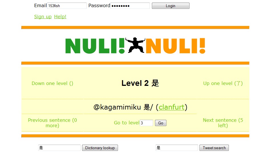

