7.11.11

Wordpress Migration - From localhost to live website

== Brief  Wordpress Migration Overview ==
http://www.makeuseof.com/tag/migrate-locally-developed-wordpress-site-live-server/

1. Prepare
2. Export The Database
3. Adjust Paths
4. Upload Files
5. Re-Import The Database
6. Edit wp-config.php

10 Steps for Local Installation of WordPress on Localhost (XAMPP)

Screenshot of phpMyAdmin (3.2.4)Image via Wikipedia


1. Place unzipped Wordpress folder in XAMPP folder (local host). Rename

appropriately, site domain name ( /mysite ) or subdomain name ( /blog).

2. Create SQL database via phpMyAdmin. Use folder name (sitename) for

database name.

3. Go to Privileges. 

3a. Add  a new user.
Enter localhost for "Host"
Choose a username and password. eg.
user = admin or demo
password = admin or demo - can be blank ONLY for local testing
Scroll down. Click Go.

 3b.Set database specific priveleges. Allows user to connect and modifiy

database. Check All. Click Go.

4. Point browser to location Wordpress installed. Click "Create a

Configuration File" button

5.  Enter Database Name, User Name, Password, Database Host that you

set in phpMyAdmin. Enter an appropriate Table Prefix. eg. sitename_
(don't use wp_ if running multiple WP installations)

6. Click the install button
7. Enter blog title and email.
8. Success! CAREFULLY Copy auto-generated password before clicking login.
9. Enter username. Paste password login to  Dashboard.
10.  Immediately update profile by changing the password to your own.

http://www.wpbeginner.com/wp-tutorials/installing-wordpress-on-a-local-server-environment/

Wordpress Template Hierarchy.Image via Wikipedia


30.10.11

Turn off WordPress Comments

A screenshot of the default WordPress theme.Image via Wikipedia


http://wordpress.org/support/topic/turn-off-comments-on-pages-by-default

NOTE: LINES OF CODE NOT SHOWING UP. WYSIWYG DELETES SCRIPT

Don Spark
Member
Posted 2 years ago #

Hi,

Simple question:

How do I make comments "turned off" by default?

I am shaping up a WP CMS for non-technical users. They shouldnt have to worry about erroneous check boxes.

Thanks!

Don Spark

TransPersonal
Member
Posted 2 years ago #

Settings >> Discussion >> uncheck "Allow people to post comments on new articles"

This applies to new posts that you will publish from now on. To disallow comments from already publish posts:

Posts >> select them all and "Edit" under bulk actions and hit apply >> choose "do not allow" next to comments and hit update posts.

mercime
Member
Posted 2 years ago #

What TransPersonal said. And, if you want to make it pseudo-permanent, you can delete the comments tag in single.php (and in page.php if you have one there)from your theme.

S.K
Member
Posted 2 years ago #

The topic title talks about "pages". Assuming that you want to continue have discussion on your blog posts but turn it off only from "pages, you'll have to remove the code snippet "" from the page.php of your theme, as mercime advised.

If your theme uses some other template for pages, you find it out and snip out the line.

S.K

Don Spark
Member
Posted 2 years ago #

I just want to turn it off by default...on pages only. I want blog posts to have comments by default but not pages. The checkbox has a checked by default. I want it un-checked by default for pages.

I am using the hybrid theme framework. That theme has a page.php which has this only this referring to comments


Is something in there putting a check in the box or does that exist somewhere else in wordpress?

We are going to be making lots of pages with nubies.

Thanks!

mercime
Member
Posted 2 years ago #

If you want to have comments in your blog posts, then leave the comments on in Settings > Discussion. Then in order to disable comments in Pages, delete in page.php

S.K
Member
Posted 2 years ago #

You can remove that line of code if you want to disable comment on pages.

Instead you can "comment out" the line of code thus:


You can remove the "//" part when you want to turn on comments on pa

Enhanced by Zemanta

29.10.11

PHP Web Design 101

The Most Powerful Way to Build Your Website


Elementary explanation of basic HTMLPHP website structure:
First defining DOCTYPES and META data then

Main 3 parts of every page:
HEADER header.php
FOOTER footer.php
SIDEBAR sidebar.php

connect together pages with main content
via php statement
PHP INCLUDE:

in at least one required
INDEX PAGE index.php

may add other pages of content with PHP INCLUDES of 3 main parts

Also gives good basic explanation of how to use CASCADING STYLESHEET, style.css,  to format entire site.

Lots of beginners tips to fix common problems like

Use MIN-HEIGHT when sizing the elements that aren't fixed height.
Zeroing MARGINS and PADDING for body selector.
Adding AUTOFLOW to get wrapping parent divs to stretch across floating child divs.
Add 'wrapper' class with AUTO MARGINS around each div you need to CENTER

Detailed explanation of how to style UNLIMITED LIST of links into a horizontal list for navigation with
DISPLAY:INLINE
TEXT-DECORATION NONE removes bullets
OVERFLOW:HIDDEN keep color from flowing beyond nav bar boundaries.

Additional videos on http://www.johnmorrisonline.com
Enhanced by Zemanta

20.10.11

Google Analytics Video and Lessons


http://www.google.com/support/analytics/bin/static.py?page=guide.cs&guide=19779&topic=19783&answer=138517


Google Analytics IQ Lessons

26.7.11

SZW Schwarzwald Music Website | Final Logo


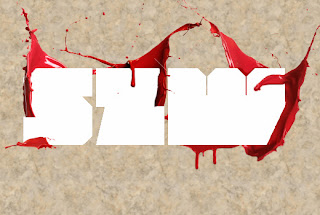
After numerous trials with filters and blend options I came up with a unique sophisticated slick marble text effect that isn't the usually 3-D blocks of stone. Then I added extensive detailing of shadows and lighting effects for each splash component. I presented the final "lipstick grunge" logo on a darker grungy aged mossy green marbleized canvas.  (click image to enlarge)

25.7.11

SZW Schwarzwald Logo | Photoshop development

Click images to enlarge.
 I created a custom pattern with a seamless real marble texture similar to his mockup. Typed "SZW" as plain text using MOD font on marbled canvas. Originally client wanted to keep text effect simple and white underneath the liquid splashes.

To avoid the "cheesiness" of plain white, I suggest adding a white satin effect created with a barely visible gradient and grey 1 px stroke.
  For some depth add very low opacity outer glow to float letters over marbled canvas.
Keeping in mind we are trying to create a new unique styling concept he has defined as "lipstick grunge" I used his original splashes in different positions in a deeper red color (instead his original orchid deep pink color) to achieve the dual impression of blood and lipstick. 

In order to achieve the effect of wrapping arround indiviual letters, I retype each letter as single character in its own layer directly over "SZW" layer. Then duplicate each rear splash on top of corresponding letter. Then used layer mask to erase splash pixels covering letters and reveal only splash pixels covering letter.

 I transformed some splashes to smaller sizes I could insert between individual letters.
 I revealed original "SZW" text layer (all 3 characters together) with outer glow underneath.
 Added low opacity inner glow to each letter. 
I cut out some small speckles from splashes to cover some space for better visual composition and increase impression of liquid movement. 

Arrows point out the subtle discrepancies in realistic lighting and shadowing on the splashes.

 I used levels and contrast adjustment layers to achieve a more realistic lighting and shadow effects on each splash layer.
I used non destructive dodge/burn technique to fix additional shading on interior components
Client full approved design so far, but we decided to allow me to come up with a "marbled" text effect.


22.7.11

SZW Schwarzwald Music Website | Layout Development


General layout developed for the Facebook page using all of the functional and graphic elements requested by the client. He only wants a single page which conveniently allows visitors to listen to his featured audio tracks, watch featured videos and check his list of upcoming events which link to Facebook Event pages. To conserve space he'd like scrollable boxes for each content module. Instead of a menu for navigating subpages, he requests a prominent horizontal menu of social networking links. Instead of audio player, he'd like to embed audio tracks from his Sound Cloud account.  Similarly he'd like to use You Tube embeds from his You Tube Channel.

Unfortunately, we cannot use this image of velvet curtains as a frame in front of You Tube video embed as he would like. I have suggested choices:

 Client's original "lipstick grunge" mockup:

21.7.11

SZW Schwarzwald Music Website | Concept Development

Knowledge of the dub-step music genre and an understanding of this client's own unique musical style is the first and most important step toward concept development.
According to Wikipedia:
Dubstep is a genre of electronic dance music that originated in south London, England. Its overall sound has been described as "tightly coiled productions with overwhelming bass lines and reverberant drum patterns, clipped samples, and occasional vocals".
This genre with Jamaican roots is described with adjectives such as grimy, dirty and funky. The client, Schwarzwald defines his personal style as being particularly dark, sinister and heavy, yet having intelligence and classical motifs. When asked to provide a visual image to evoke the emotions for his styling, I was given the great marble sculpture, "Lucifer" for inspiration.
Le génie du mal (installed 1848) or The Genius of Evil, known informally in English as Lucifer or The Lucifer of Liège, is a religious sculpture executed in white marble by the Belgian artist Guillaume Geefs
I  found this montage which we agreed on for an additional source of inspiration for styling.

20.7.11

SZW Schwarzwald Music Website | Original Logo

After difficulties procuring schwarzwald domain name, not to mention my advice to choose a domain name that's not difficult to say and spell, the abbreviation 'SZW' has been chosen to represent. Client chose MOD font, perfect choice for an artistic logo. Its broad width and geometric shape lends itself to a multitude of advance text effects and makes an excellent statement for the clients identity. Besides website logo, I can imagine limitless possibilities for CD/album covers, ads and posters. Even unadorned as simple black text this font makes a great typographic logo. This recreation of clients own design inspired by Milk and Blood Typography Poster photoshop tutorial.

SZW Schwarzwald Music Website | Client's Mockups

designables latest client, an audio producer who specializes in dub-step genre, needs a website and Facebook Fan Page to promote his music and network with other artist. His main objective at this point in his career is to provide an internet presence for keeping his colleagues up to date on his music projects and upcoming events. These primitive photoshop renderings were created by the client:

First concept uses logo created with Metropolis font from the German classic silent film.

Second concept uses MOD font

The client has conceived his own visual style which he calls "lipstick grunge." He has chosen velvet and marble as predominant textures for his look and feel. My only concern is that his current choice of colors (especially the pink!) doesn't quite communicate his dark heavy dub-step musical style which is often described by people in in his business as "dirty". This client clearly has some amateur graphic talents and some very specific ideas about the design for his website, but needs my skills to develop his concepts into professional graphic designs and a functional website.

14.7.11

Revised Logo: Website name change to Mirror Connect

- click image to enlarge -
Well, the site name is to be mirrorconnect.net.  ( domain name mirrormatch unavailable) Although revised logo lacks some of the the visual symmetry of mirror match, I actually liked mirror connect better for conveying "social network" aspect of the site. It broadens the audience for the site beyond just romantic relationships.

Mirror Match Finalized Logo Redesign

Finalized logo for Mirror Match Dating website.
This logo conveys an inviting message of love and romance in a friendly, casual atmosphere to a mainstream audience of predominantly single young adults. Bolder font also has better impact for reading and recognition on the web page.

It also fixed the problem of the original heart which was a font only licenced for "personal use" by replacing it with an licence-free illustration that actual fits redesign better .

The first concept after name change.

The original logo submitted with the client's assets.

The steps explaining the development of the final logo:


13.7.11

Mirror Match Logo Redesign | Ubuntu Font

The Ubuntu Bold font capture the contemporary casual mainstream feel I am lookng for. Its rounded character complements the roundness of the solid heart.
Ubuntu only available in Bold, so I used slight variation of color to distinguish the words. I also tighten up the logo by lowering the heart into a more balance position.


For the finalized logo, a little "icing" added to the words and heart for some slight dimensionality. The new reflection seems more balance by showing more than the tip of the heart. 

12.7.11

Mirror Match Logo Redesign | Maven Pro Font

Exploring the contemporary Maven Pro font which has rounded and angular characteristics for logo. The formal navy blue has been change to a more up to date casual and inviting bright blue. The heart's harsh bright true red has been desaturated to a softer red that's more pleasing to the eye.

Having a solid heart resolves the inability to have the the stroke on the heart matches the font's stroke thickness. The simplicity of the solid heart looks more balnced as well as communicates its symbolism (LOVE) better.

I have so me concern about the placement of the heart so high that it will not "realistically" be rendered in the reflection.

Mirror Match Color Layout

Color layout for the early development of the general look & feel for the website. Found a portfolio of "couples" photography on Veer.com that suits the clean contemporary style and target audience mainstream young adults. The photo for the landing page was chosen because its more visually interesting than the standard head on shots. The dynamic positioning of the subjects from the side could be used (after a horizontal flip) to point toward the center where the key message will be.

11.7.11

Mirror Match | Choosing Appropriate Stock Photos for Style and Target Audience

 Using photos of the same couple throughout will give continuity to the site's image and identity. Its an inexpensive way of having "spokes-models" for the site's branding. Any other photos used will be taken from the same photographer's portfolio to maintain the same style throughout the site.


10.7.11

Mirror Match General Layout

General layout for creating a custom skin for the dating scripts I am purchasing to develop dating website. The DatingSoftware Vplus software includes every social networking and matchmaking feature the client seeks as well as some additional feature to engage members and monetize the sight.

9.7.11

Mirror Match Logo Redesign | Font Comparisons


Shopping around for contemporary, rounded and/ or san serif fonts to achieve a more appropriate font for dating website's logo.

Maven Pro

Museo 700

 Ninuto
 Otari Bold
Ubuntu

1.7.11

Mirror Match Original Logo

Original logo submitted with client assets.
Blue glow effect muddies the otherwise nice reflection logo concept.
First tweeking of original logo after name change. Removed blue glow. Provide contrast with red heart. The font is too formal and traditional for dating website. Will seek more contemporary casual font to be attractive to single young adults. Perhaps something thicker and san serif.

1.6.11

CBC Print Logo: Final versions

White
Black
Greyscale
Full Color - Teal

Final vector versions developed for print use. Designed with Inkscape. Orbitron font.
Related Posts with Thumbnails